MORROW
Dynamic Scorecard
A unified solution that streamlined the fragmented scorecard, resulting in a 40% increase in coach team efficiency and doubling the login frequency of Morrow members.
Role
Product Manager
Product Designer
Prototyper
Tools
Figma
PRD
Timeline
Jan - Apr, 2024
Context
Morrow - A financial platform built for the American worker
Morrow is a financial platform designed to make American workers’ money work as hard as they do. It
identifies financial opportunities and crafts personalized action plans to ensure progress.
Morrow’s four-step process includes defining money goals, meeting with a financial coach, receiving an
action plan, and capturing value, helping members achieve financial improvement.
While the Financial Scorecard, the core tool designed to accomplish this, has proven effective,
its fragmented nature has led to inefficiencies for both coaches and members, undermining its full
potential.
Business Model
B2B2C
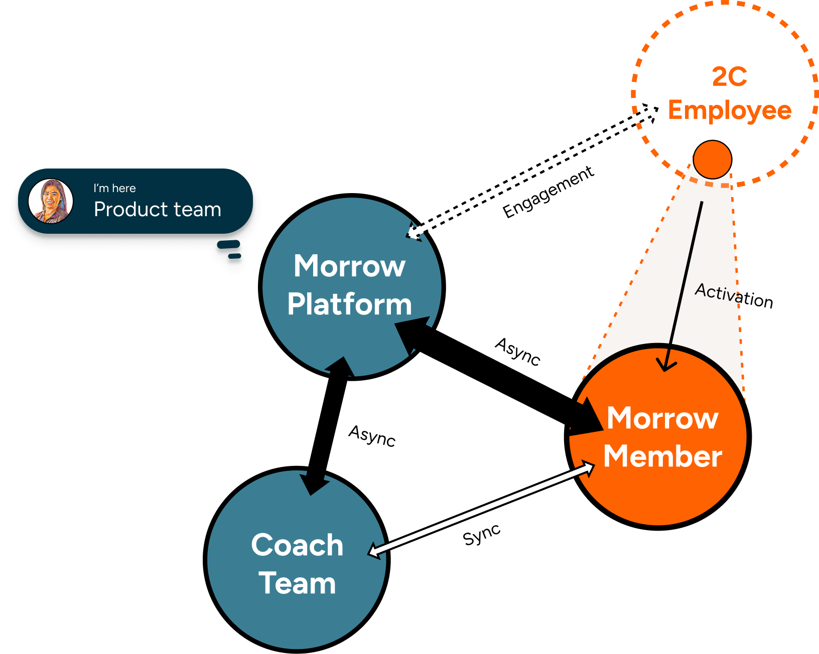
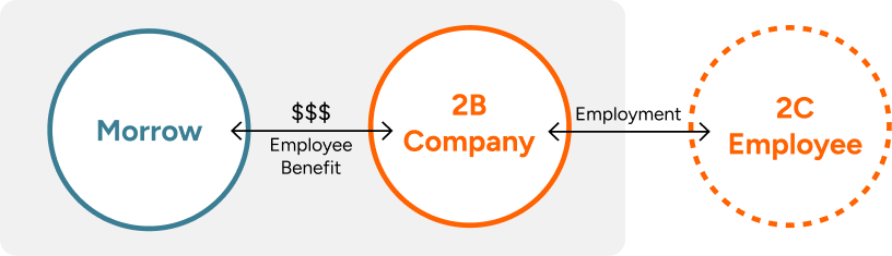
Stakeholder Map
Morrow Platform supports Coach Team internally and Morrow Members externally.
Many American workers earn a paycheck but struggle to save. No matter the financial goals —- whether you’re A Soon-To-Be Retiree or A Frustrated Debtor —- Morrow offers synchronous coaching and asynchronous platform services to identify knowledge gaps and opportunities, highlighting low-hanging fruit to help you gain positive feedback in your financial journey.
Problem
Fragmented Scorecard Workflow Hinders Efficiency and Member Experience
The Financial Scorecard, a tool crucial for assessing members’ financial health and action plans, was fragmented across platforms. This led to inefficiencies for coaches and a disjointed experience for members, undermining their financial growth.
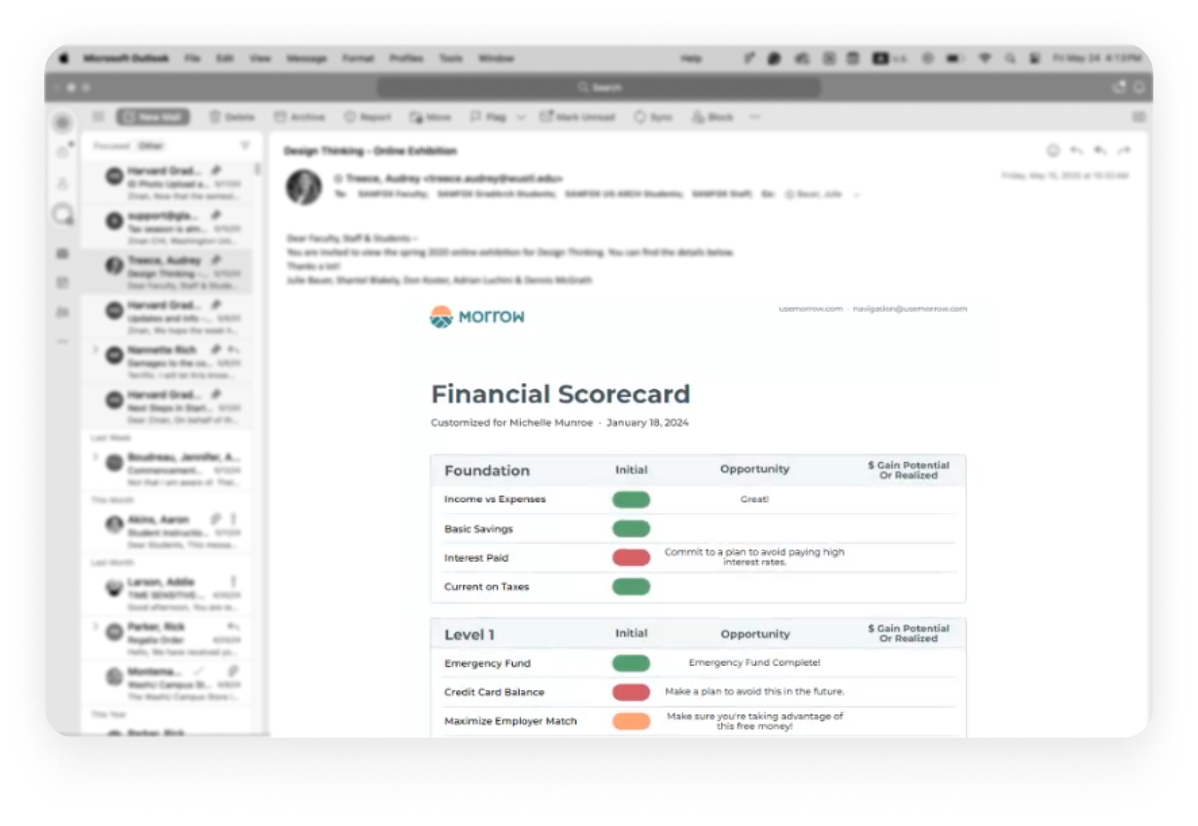
Existing Scorecard
Coaches prepare a financial scorecard after 1-on-1 sessions and send it as a PDF via email to members.
Coach Team
Fragmented experience
Complex workflow
Data silos
Learning curve for new coach
Limited member behavior insights

Morrow Member
Fragmented experience
Hard to find “that email”
Hard to track progress
Send email to communicate
Isolated info

Solution
Unified Experience on a Centralized Platform
To tackle these challenges, we redesigned the PDF Scorecard into a Dynamic Scorecard within a centralized platform. This unified design aimed to streamline workflows, enhance data centralization, and improve user engagement. Additionally, it bridges the asynchronous communication gap between coaches and members with an intuitive user experience.
Existing Scorecard
Coaches prepare a financial scorecard after 1-on-1 sessions and send it as a PDF via email to members.
Coach Team
Simple workflow
Improve efficiency
Easier onboarding
Centralized data
Morrow Members
Easy to find
Interactive
Leave comments
Real-time Sync
Business Incentives
Data-driven insights
Increase member engagement
Approach
Research, Workshop, Design Interations
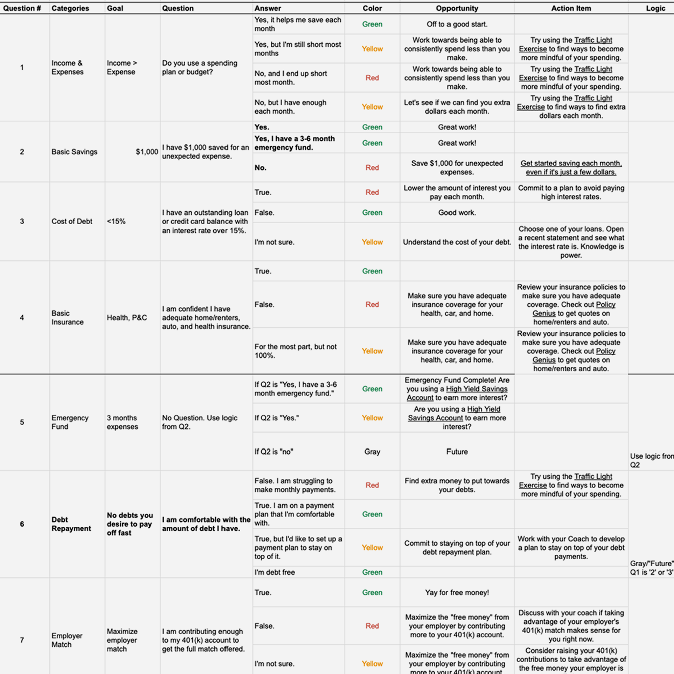
Through in-depth research, interviews with coaches, and cross-functional workshops, we identified key pain points and opportunities. We documented these insights in a Product Requirements Document (PRD) and defined the product scope to balance essential features with feasibility and user needs.
Research
Through interviews with coaches, I gathered information about their workflows and summarized it for technical review and development.
Workshop
I conducted workshops with product team members to brainstorm and align on the problem definition and solution
Design Iterations
From sketch to wireframe to high-fidelity design, key decisions were discussed among various options to narrow down the direction moving forward.
Define Scope
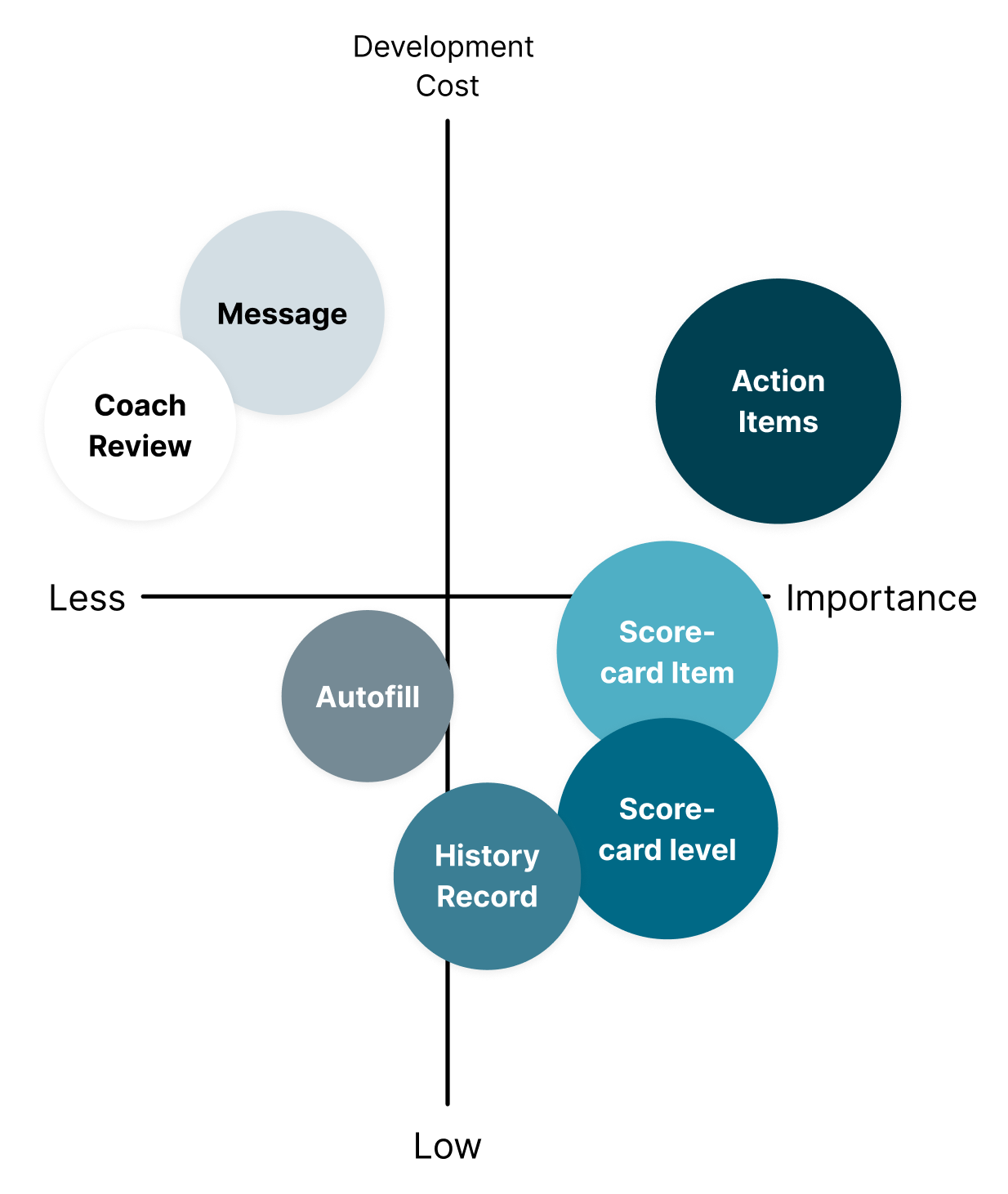
With Engineering team's contribution, we balanced the dev cost and importance and decided to move with the key features -- editable scores, collapsible tasks, customizable action plans, and a history record switch -- each designed with user-centricity in mind.
Design
High-Fidelity Design and Interactive Prototype
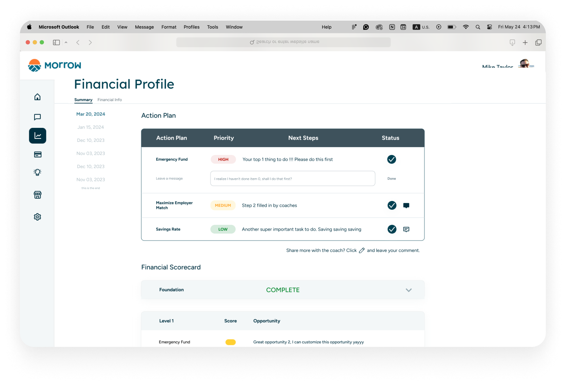
I created high-fidelity designs and iterated on design systems, prototyping interactive demos to illustrate how the integrated scorecard would work on desktop and mobile. Key features included editing scores/opportunities, collapsing completed tasks, marking actions complete, and viewing progress over time. Usability testing ensured ease of use for coaches and members.
Editable Scorecard
Coaches can edit scores and opportunities with double-click, streamlining the
process with autofilled opportunities.
Scorecard Collapse
The complete Scorecard is collapsed to reveal success and
leave space for ongoing tasks.
Action Plan Interaction
Coaches customize action plans. Members can complete
action items and leave messages, syncing in real-time.
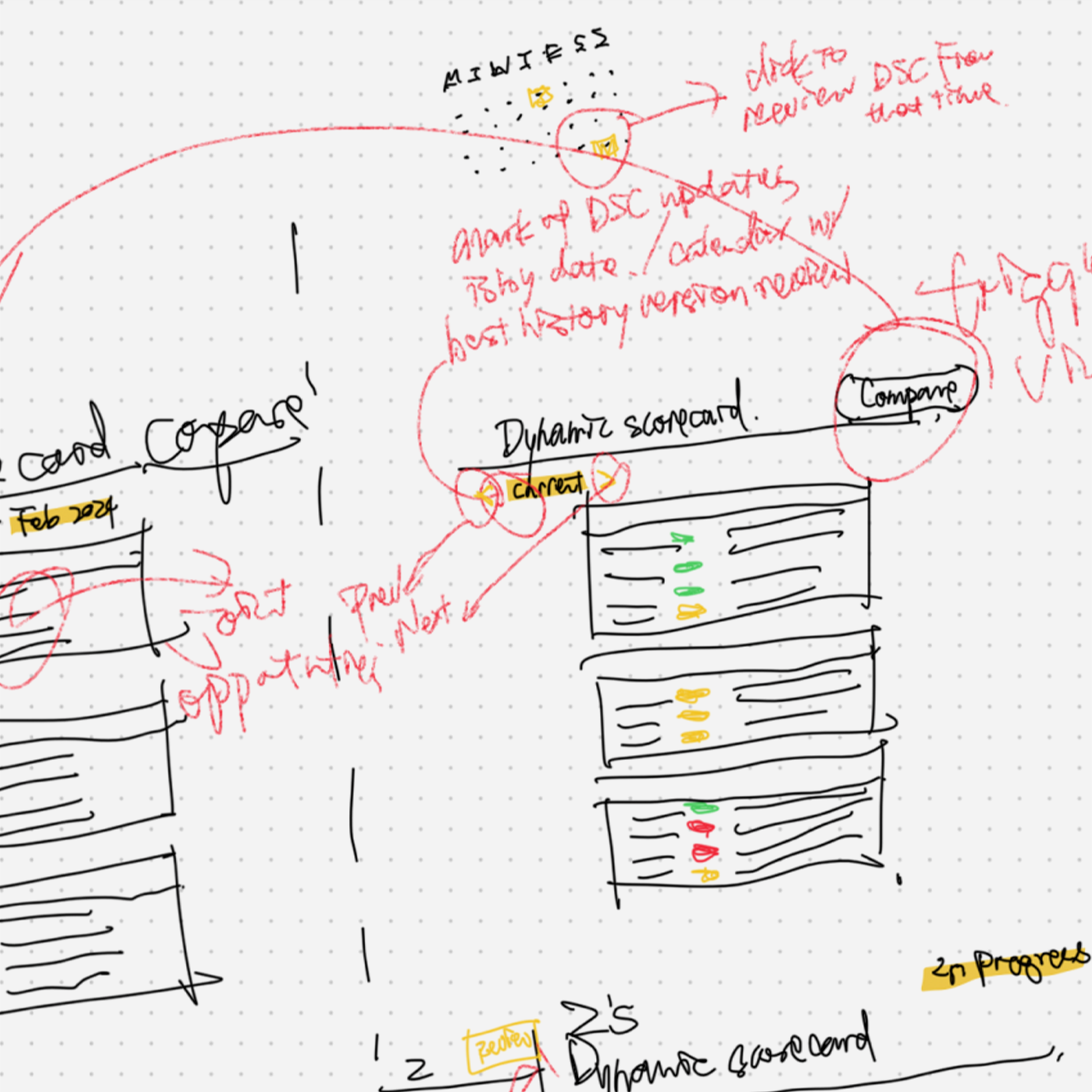
History Record Switch
Members can view different scorecard versions to track their progress.
We see the growth and celebrate it!
Responsive Design
Mobile Prototype - Reuse of Desktop Components
Insights from coach calls indicated that 60% of Morrow Members use mobile devices. The Dynamic Scorecard Mobile Design is crucial for member outreach. We reorganized desktop components in their stack and proportions to leverage familiarity and development benefits. Certain elements were designed to enhance mobile visualization, such as score summary icons next to each scorecard level.
Financial Scorecard — Horizontally oriented desktop elements are vertically stacked for mobile devices. Icons are used before the level indicator to summarize the scorecard. Traffic light indicators are aligned on the right as a visual anchor for smaller devices.
Action Plan — Each action plan item on mobile nests in its own block, allowing users to focus on one item at a time, complete it, and then move on to the next. Complete buttons are positioned on the left, ensuring easy access for users even when holding the phone with one hand.
Complete Items — On mobile devices, the scorecard level collapse feature is enabled for each level, regardless of completeness. This serves as a control to create additional space for the current focus.
History Record — On mobile devices, the scorecard version selection is positioned horizontally with an overflow, conserving space for the scorecard content. It remains fixed at the top, allowing for easy selection of different records at any time.
Thoughts
End-to-End Product Cycle
By synthesizing insights from Morrow’s teams and maintaining strong user feedback loops, we delivered a
product that improved coach efficiency by 40% and significantly enhanced user
engagement. The Dynamic Scorecard has doubled member login frequency and increased the completion
rate of action items by 153%.
The next step involves incorporating user
feedback and
evolving initial features, like messaging, into fully developed capabilities while closely monitoring user
trends. This will ensure the Dynamic Scorecard continues to meet user needs and drive engagement.